Following up a bit on my recent post, it seems I’m one of the data points in the latest Nanos Research poll (PDF).
While my vote is still undecided, the one thing I do know is that my least-desired choice by far (of the likely candidates) is Rob Ford, for plenty of reasons, the same candidate who this new poll says is now far ahead of everyone else. While this does seem dire, there are still tons of undecided voters. I decided to calculate a few stats, shown below. It’s just an screenshot from Excel, I’m too lazy to recode it in HTML
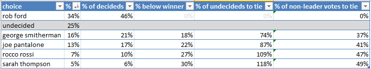
As you can see in the second-to-last column, the #2 candidate needs a “mere”; 3/4 (74%) of undecides to switch to him in order to be tying Ford for first place, or alternately, 37% of all votes that are now any other non-Ford candidate or undecided. That’s possible.
One quick way for a candidate to gain votes would be for another to drop out and endorse them. This would really only make sense for a candidate who has both no chance of winning and would prefer someone other than the current leading candidate of the remaining candidates. Of the likely candidates this only makes sense for Rossi and Thompson, whose combined votes added to #2 (Smitherman) would still be insufficient. Also a bit sad, since I’m leaning slightly towards preferring Thompson right now.
Anyhow, I made two visualizations of all the existing poll data which I grabbed from Wikipedia. I took out the two oldest polls, and otherwise ignored the sample sizes and margins of error, and I plotted the time of the poll as halfway between when it began and ended. I also hid all candidates who’ve withdrawn. For both graphs I’ve extended the horizontal axis (time) to go up to the date of the election so that it’s easier to see how much room there still is for changes.

Here you can see the undecides falling (but still high), and the rise of Rob Ford, somewhat by taking votes from Smitherman but mostly by converting undecideds. You can also observe the increase in poll frequency as we get closer to the election.

Here’s a slightly different way of looking at it, and I’ve added candidate photos (from Wikipedia mostly, Thompson’s from her website) for clarity. Note that the photos are sized roughly to fit, not according to any metric. Again, it’s clear that Forb’s increase came from the undecideds, having begun with almost no support at all. Contrast this with Smitherman, who seems to have almost the exact same support he started with.
Who knows, maybe Pantalone’s recent rise will turn into a momentum?
Don’t plot poll results by directly interpolating them. They don’t represent exact numbers, they (together with their margins of error) represent an estimate where the actual numbers are, so a graph like this is more appropriate: http://en.wikipedia.org/wiki/File:2008FederalElectionPolls.png
that’s quite true, although the wikipedia page didn’t include the margins of error, and I didn’t want to track that down. Plus I would have struggled more to figure out how to creat the plots 😉
feel free to try it yourself.